What Colors Go Together in Interior Design: A Comprehensive Guide
The selection and combination of colors is a fundamental aspect of interior design, influencing mood, perception of space, and the overall aesthetic appeal of a room. Understanding color theory and the principles of color harmony is crucial for creating visually pleasing and functional interior spaces. This article explores various color combinations, the reasoning behind their effectiveness, and how they can be applied in different interior design scenarios.
Understanding the Color Wheel and Color Harmonies
The color wheel is the foundational tool for understanding color relationships. It visually represents the spectrum of colors, arranged in a circle, showing how primary, secondary, and tertiary colors relate to each other. Primary colors (red, yellow, and blue) are the base from which all other colors are derived. Secondary colors (green, orange, and violet) are created by mixing two primary colors. Tertiary colors (red-violet, blue-violet, blue-green, yellow-green, yellow-orange, and red-orange) are formed by mixing a primary color with an adjacent secondary color.
Color harmonies are systematic ways of combining colors based on their positions on the color wheel. These harmonies create visually balanced and appealing compositions. Several commonly used color harmonies include:
Monochromatic: This harmony uses variations of a single color, incorporating different tints (adding white), shades (adding black), and tones (adding gray). Monochromatic schemes create a sense of unity and serenity. For example, a room predominantly in various shades of blue, from a light sky blue to a deep navy, can evoke a calming and sophisticated atmosphere.
Analogous: This involves using colors that are adjacent to each other on the color wheel. Analogous color schemes are harmonious and pleasing to the eye due to their close relationship. An example would be a combination of blue, blue-green, and green, creating a cohesive and natural feel, often used in spaces aiming for a relaxing ambiance.
Complementary: This harmony combines colors directly opposite each other on the color wheel. Complementary color schemes create high contrast and visual excitement. Red and green, blue and orange, and yellow and violet are classic examples. When using complementary colors, it's important to balance their intensity and dominance to avoid a jarring effect. Usually, one color is used as the primary hue and the other as an accent.
Split-Complementary: This is a variation of the complementary scheme. Instead of using the direct complement of a color, it uses the two colors adjacent to its complement. For example, instead of using red and green, a split-complementary scheme would use red with blue-green and yellow-green. This provides a similar level of contrast as a complementary scheme but is often considered more balanced and easier to work with.
Triadic: This harmony uses three colors that are equally spaced on the color wheel, forming an equilateral triangle. Examples include red, yellow, and blue; or orange, green, and violet. Triadic color schemes are vibrant and dynamic but require careful balancing to avoid visual overload. One color is typically chosen as the dominant hue, with the other two used as accents.
Tetradic (Double Complementary): This scheme uses two pairs of complementary colors, forming a rectangle on the color wheel. This is the richest of all the harmonies and is the trickiest to balance. An example would be using blue, orange, yellow, and violet together. It works best when one color is dominant, and the others are used sparingly as accents.
Applying Color Combinations in Different Rooms
The specific color combinations suitable for a room depend on its purpose, size, and the desired mood. Consider the following applications for various spaces:
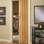
Living Rooms: Living rooms are often considered the heart of the home and can benefit from a range of color schemes. Warm and inviting colors like beige, cream, and soft yellows create a welcoming atmosphere. These can be paired with accent colors like deep blues, greens, or oranges to add visual interest. Alternatively, a monochromatic scheme in shades of gray can be sophisticated and versatile, allowing for the introduction of vibrant accents through furniture and accessories. For a more dramatic effect, a complementary scheme, such as blue and orange, can be used, but it is important to balance the intensity of the colors. Textiles and textures also play a crucial role in harmonizing a living room color scheme. Incorporating different textures like velvet, linen, and wool can add depth and visual interest, even with a limited color palette.
Bedrooms: Bedrooms are spaces for relaxation and rest, so calming and soothing colors are often preferred. Cool colors like blues, greens, and lavenders are known for their calming properties. A monochromatic scheme using different shades of blue or green can create a serene and tranquil environment. Neutral colors like soft grays, creams, and whites can also be used as a base, with accents of pastel colors for a touch of warmth and personality. A split-complementary scheme, such as blue with yellow-orange and red-orange, can provide a subtle contrast without being overwhelming. The amount of natural light in a bedroom should also be considered when choosing colors. Lighter colors can help brighten a dark room, while darker colors can create a cozy and intimate feel in a room with plenty of natural light.
Kitchens: Kitchens can benefit from a variety of color schemes, depending on the desired style and functionality. White and bright colors like yellow and light blue can create a clean and airy feel, making the space seem larger and more inviting. These can be combined with natural wood tones and stainless steel accents for a modern look. For a more traditional kitchen, warm and earthy colors like beige, brown, and terracotta can be used. These can be paired with accents of green or blue to add a touch of freshness. A triadic scheme, such as red, yellow, and blue, can be used to create a vibrant and energetic kitchen, but it is important to balance the colors to avoid visual clutter. Backsplashes, countertops, and cabinetry are key elements to consider when planning a kitchen color scheme. Utilizing different textures and finishes can add depth and visual interest to the space.
Bathrooms: Bathrooms are often small spaces, so light and airy colors are generally preferred. White, light blue, and light green can create a clean and refreshing feel. These can be combined with natural materials like wood and stone for a spa-like atmosphere. Accents of brighter colors, such as teal, coral, or yellow, can add a touch of personality. A monochromatic scheme in shades of gray or beige can create a sophisticated and calming bathroom. The lighting in a bathroom is crucial for creating the right ambiance. Warm lighting can enhance the colors and create a cozy feel, while cool lighting can make the space feel brighter and more hygienic. Consider using different types of lighting, such as ambient, task, and accent lighting, to create a layered and balanced lighting scheme.
Factors Influencing Color Perception and Selection
Several factors influence how colors are perceived and how they should be selected for interior design. These include:
Lighting: Natural and artificial lighting significantly affect how colors appear. Natural light tends to enhance the true colors of a space, while artificial light can alter them. Incandescent light can make colors appear warmer, while fluorescent light can make them appear cooler. It is important to consider the type and amount of lighting in a room when selecting colors. Testing paint samples under different lighting conditions is essential to ensure the desired effect is achieved.
Room Size and Shape: Color can visually alter the perception of a room's size and shape. Light colors tend to make a room appear larger and more open, while dark colors can make a room feel smaller and more intimate. Vertical stripes can make a ceiling appear higher, while horizontal stripes can make a room appear wider. It is important to consider the proportions of a room when selecting colors to create a balanced and harmonious space.
Personal Preferences: Ultimately, personal preferences play a significant role in color selection. While color theory provides a framework for creating harmonious color schemes, it is important to choose colors that resonate with the individual's taste and personality. Consider the psychological associations of different colors and how they make you feel. For example, blue is often associated with tranquility, while red is associated with energy and passion. Incorporate your favorite colors into your home in a way that is both aesthetically pleasing and personally meaningful.
Existing Elements: Existing architectural features, furniture, and accessories should also be considered when selecting colors. The color scheme should complement the existing elements and create a cohesive and unified look. If you have a favorite piece of furniture or artwork, use it as a starting point for your color scheme. Consider the colors and textures of the existing elements and choose colors that will enhance and complement them.
Color Psychology: Color psychology explores the emotional and psychological effects of colors on individuals. Different colors evoke different feelings and associations. Understanding these associations can help in selecting colors that create the desired mood and atmosphere in a room. For example, green is often associated with nature and freshness, making it a popular choice for bedrooms and living rooms. Yellow is associated with happiness and optimism, making it a good choice for kitchens and entryways. Red is associated with energy and passion, making it a good choice for dining rooms and accent walls. It is important to consider the cultural and personal associations of colors as well, as these can vary depending on the individual and their background.
Selecting the right colors for an interior design project involves a combination of understanding color theory, considering the specific characteristics of the space, and incorporating personal preferences. By carefully considering these factors, it is possible to create spaces that are both visually appealing and emotionally resonant.

Choosing Right Colors How To Use Psychology For Interior Design

Color Palette For Home 12 Combos Designers Love Havenly Interior Design Blog

30 Living Room Color Ideas Best Paint Decor Colors For Rooms

Choosing The Right Colours For Interior Design Of Your Home Fineline

Choosing Right Colors How To Use Psychology For Interior Design

15 Designer Tricks For Picking A Perfect Color Palette

How To Use Colors In Interior Design

Color Palette For Home 12 Combos Designers Love Havenly Interior Design Blog

Color Theory 101 Ogous Complementary And The 60 30 10 Rule

20 Top Interior Color Schemes For Your House Design Foyr Neo