What Color Represents Your Interior Design Style?
Color, in the context of interior design, is significantly more than a decorative choice. It acts as a foundational element, directly influencing the mood, perception of space, and overall aesthetic of a room. Choosing the right color palette is crucial to successfully expressing a chosen interior design style. Different styles inherently gravitate towards certain color families, creating specific visual languages that are easily recognizable and evoke particular feelings. This article explores how various colors are associated with and contribute to the defining characteristics of several popular interior design styles.
The impact of color extends beyond mere visual appeal. It can psychologically affect inhabitants and visitors, influencing their emotions and behavior. Warm colors, such as reds, oranges, and yellows, are often associated with energy, excitement, and warmth. They can create a sense of intimacy and comfort. Conversely, cool colors like blues, greens, and purples tend to evoke feelings of calmness, serenity, and stability. Neutral colors, including whites, grays, and beiges, provide a backdrop that allows other elements in the room to take center stage while contributing to a sense of spaciousness and sophistication.
When selecting colors for an interior design project, it is important to consider the specific attributes of the room, such as its size, natural light sources, and intended function. A small room with limited natural light might benefit from lighter, brighter colors to create the illusion of more space, while a larger room with ample natural light can accommodate bolder, richer hues. The intended function of the room also plays a significant role. For example, a bedroom, designed for relaxation and rest, would typically feature calming colors, whereas a living room, meant for socializing and entertainment, could incorporate more vibrant and stimulating shades.
Understanding Color Psychology and its Application
The field of color psychology studies the effects of colors on human emotions and behaviors. This is a critical consideration in interior design, as the colors chosen for a space can directly influence the occupant’s mood and well-being. For example, blue is often associated with tranquility and is a popular choice for bedrooms and bathrooms. Green, reminiscent of nature, promotes feelings of balance and harmony, making it suitable for living rooms and home offices. Yellow, a cheerful and optimistic color, can brighten up kitchens or entryways but should be used sparingly to avoid overstimulation.
Red, known for its energy and passion, is often used as an accent color to add drama and excitement. However, an excess of red can be overwhelming and even agitating for some individuals. Orange, a blend of red and yellow, evokes feelings of warmth, enthusiasm, and creativity, and is often used in spaces intended for social interaction. Purple, associated with royalty and luxury, can add a touch of elegance and sophistication, but darker shades can also create a sense of mystery and introspection. The careful application of color psychology can enhance the overall experience of a space and contribute to the desired atmosphere.
Neutral colors, while often perceived as understated, play a vital role in interior design. White, representing purity and cleanliness, creates a sense of spaciousness and allows other colors to stand out. Gray, a versatile neutral, can be both modern and sophisticated, providing a calming backdrop for bolder accents. Beige, a warm neutral, adds a touch of comfort and earthiness, creating a welcoming and inviting atmosphere. By understanding the psychological effects of various colors, designers can create spaces that are not only visually appealing but also conducive to the well-being of the occupants.
Color Palettes Associated with Specific Interior Design Styles
Different interior design styles utilize distinct color palettes to achieve their characteristic look and feel. Understanding these associations is crucial for replicating a specific style authentically.
Minimalist:
The minimalist style is characterized by simplicity, functionality, and a focus on essential elements. The color palette typically consists of neutral tones, such as white, gray, and beige. These colors create a sense of spaciousness and tranquility, allowing the clean lines and uncluttered spaces to take center stage. Accent colors, if used at all, are often muted and understated, such as soft blues, greens, or browns, to avoid overwhelming the minimalistic aesthetic.Scandinavian:
The Scandinavian style emphasizes functionality, simplicity, and natural materials. Like minimalism, it heavily relies on neutral colors, particularly white and light gray. However, Scandinavian design often incorporates warmer tones, such as beige and light wood, to create a cozy and inviting atmosphere. Pops of color, such as blues, greens, and yellows, are frequently used as accents to add visual interest without disrupting the overall sense of calm.Bohemian:
The bohemian style embraces eclecticism, individuality, and a relaxed, unconventional atmosphere. The color palette is typically rich and vibrant, featuring warm earthy tones, such as browns, oranges, and reds, as well as jewel tones, such as emerald green, sapphire blue, and amethyst purple. These colors are often combined in unexpected and playful ways, creating a visually stimulating and expressive space. Textiles with intricate patterns and textures further enhance the bohemian aesthetic.Mid-Century Modern:
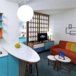
The mid-century modern style is characterized by clean lines, organic shapes, and a focus on functionality. The color palette typically includes both neutral and bold colors. Neutrals, such as white, gray, and brown, provide a calming backdrop, while pops of color, such as mustard yellow, avocado green, and burnt orange, add a touch of retro flair. The use of natural materials, such as wood and leather, further enhances the mid-century modern aesthetic.Industrial:
The industrial style draws inspiration from warehouses and factories, featuring raw materials, exposed brick, and metal accents. The color palette typically consists of neutral tones, such as gray, black, and white. These colors create a sense of urban sophistication and highlight the architectural details of the space. Pops of color, such as red or blue, are often used as accents to add visual interest and contrast.Coastal:
The coastal style evokes the feeling of being by the sea, with a focus on light, airy spaces and natural elements. The color palette typically includes shades of blue, green, and white, reminiscent of the ocean and sky. These colors create a sense of calm and serenity, while natural materials, such as wood and linen, add a touch of warmth and texture. Accents of coral, sand, and sea glass further enhance the coastal aesthetic.Practical Application: Choosing the Right Colors for Your Space
Successfully incorporating color into an interior design project requires a thoughtful and strategic approach. It's essential to consider the existing architectural features of the space, the amount of natural light available, and the intended function of the room.
Begin by identifying the architectural features that will remain in the space, such as flooring, trim, and any existing fixtures. These elements will serve as a foundation for your color palette. If the flooring is dark wood, for instance, you may want to choose lighter wall colors to create a sense of contrast and prevent the room from feeling too heavy. Or, if you have beautiful crown molding, select a color that will draw attention to that architectural detail.
Next, evaluate the amount of natural light available in the room. Rooms with ample natural light can accommodate darker, richer colors without feeling oppressive. However, rooms with limited natural light may benefit from lighter, brighter colors to maximize the sense of spaciousness and illumination. Consider using mirrors to reflect light and brighten up darker spaces.
Finally, consider the intended function of the room. Bedrooms, designed for relaxation and rest, should typically feature calming colors, such as blues, greens, or lavenders. Living rooms, meant for socializing and entertainment, can accommodate more vibrant and stimulating colors, such as yellows, oranges, or reds. Kitchens, where food preparation and dining take place, can benefit from warm, inviting colors, such as yellows, oranges, or browns. Home offices, where focus and concentration are essential, should feature calming and neutral colors, such as greens, blues, or grays.
Before committing to a specific color palette, it is always a good idea to test paint samples on the walls to see how they look in different lighting conditions throughout the day. Observe how the colors interact with the existing architectural features and furnishings. This will help you make informed decisions and ensure that the chosen colors create the desired atmosphere and aesthetic.
Ultimately, the choice of colors for an interior design project is a personal one. It should reflect the individual tastes and preferences of the occupants while also complementing the overall style and function of the space. By understanding the principles of color psychology, the associations between colors and interior design styles, and employing a thoughtful and strategic approach, one can create a space that is not only visually appealing but also conducive to comfort, well-being, and a sense of personal expression.

2024 Color Trends And What It Means For Interior Design Fab Everyday

The Meaning Of Color Red

Interior Design Color Meanings

20 Top Interior Color Schemes For Your House Design Foyr Neo

30 Best New Color Combinations Stylish Combos For 2024

20 Top Interior Color Schemes For Your House Design Foyr Neo

Diffe Shades Of Turquoise In Home Decor Kbm D3signs

How To Achieve Color Harmony In Home Decoration

10 Contemporary Interior Design Ideas Of 2024 Designcafe

Color 101 Learn The Underlying Meaning Of Your Favorite Shades