Choosing the Right Color Palette for Your Interior
Selecting an interior color palette is a crucial decision that significantly impacts the ambiance and overall feel of a space. The chosen colors influence mood, affect perceived size, and contribute to the cohesiveness of the design. A well-considered color palette can transform a room from feeling lackluster and uninspired to being vibrant, inviting, and reflective of the inhabitants' personalities. Therefore, understanding the principles of color theory and the psychological effects of different hues is paramount when embarking on an interior design project.The process of selecting a color palette involves more than simply picking favorite colors. It encompasses an analysis of the room's functionality, natural light exposure, existing architectural elements, and the desired atmosphere. Successful color palettes often incorporate a combination of primary, secondary, and tertiary colors, balanced with neutral tones to create visual harmony and prevent overwhelming the space. The type of paint finish applied also affects the perception of color and should be considered alongside the chosen palette.
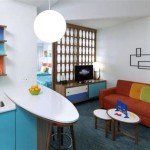
One common approach is to start with a single inspiration point, such as a piece of artwork, a rug, a patterned fabric, or even the view from a window. This focal point provides a foundation from which to extract the primary colors that will serve as the dominant hues within the room. From there, complementary and analogous colors can be incorporated to add depth, visual interest, and a sense of balance. Understanding the nuances of color temperature (warm vs. cool) is also essential for creating the desired mood. Warm colors like reds, oranges, and yellows tend to evoke feelings of energy and excitement, while cool colors like blues, greens, and purples are associated with tranquility and relaxation.
Understanding color relationships is crucial for constructing a successful color palette. Color theory provides a framework for understanding how colors interact and how to use them effectively. The color wheel is a visual representation of these relationships, showcasing primary, secondary, and tertiary colors and their various combinations. Common color schemes include monochromatic, analogous, complementary, triadic, and tetradic. Each scheme offers a distinct approach to color selection and delivers a unique aesthetic outcome.
Understanding the Fundamentals of Color Theory
Color theory provides the foundation for informed color selection. It explores the relationships between colors and their impact on perception. The color wheel is a primary tool in understanding these relationships. It visually represents the spectrum of colors, organized in a circle, demonstrating how primary colors (red, yellow, blue) combine to create secondary colors (green, orange, purple), and how further mixing yields tertiary colors. Colors are also categorized as warm or cool, influencing the overall ambiance of a space.
Monochromatic color schemes utilize variations of a single hue, creating a sense of harmony and sophistication. They often employ different tints (adding white) and shades (adding black) of the base color to introduce depth and prevent monotony. Analogous color schemes feature colors that are adjacent to each other on the color wheel, such as blue, blue-green, and green. This approach generates a harmonious and calming effect. Complementary color schemes pair colors that are opposite each other on the color wheel, such as red and green, or blue and orange. This creates high contrast and visual energy, requiring careful balancing to avoid overwhelming the space.
Triadic color schemes use three colors evenly spaced on the color wheel, such as red, yellow, and blue, or green, orange, and purple. This approach offers a vibrant and playful aesthetic. Tetradic color schemes employ two sets of complementary colors, providing a complex and dynamic palette. These schemes require careful consideration to ensure visual balance and avoid a chaotic appearance. Understanding these fundamental principles of color theory enables informed decisions and the creation of visually appealing and harmonious interior spaces.
Beyond these basic schemes, variations and adaptations exist, allowing for creative expression and customization. The key is to understand the underlying principles and apply them strategically to achieve the desired aesthetic result. Experimentation with different color combinations and proportions is essential for discovering the most effective palette for a specific space and its intended purpose.
Considering the Impact of Light and Architectural Features
The amount and type of natural light significantly influence the way colors appear in a room. North-facing rooms, which receive cooler, indirect light, tend to make colors appear more muted and subdued. Warmer colors can help to counteract this effect, creating a cozier and more inviting atmosphere. South-facing rooms, on the other hand, receive abundant, warm sunlight, which can intensify colors and create a brighter, more vibrant space. Cooler colors can help to balance this warmth and prevent the room from feeling overly intense.
East-facing rooms experience warm, golden light in the morning and cooler light in the afternoon, while west-facing rooms receive cooler light in the morning and warm, intense light in the evening. These variations in light throughout the day should be considered when selecting colors, as they can dramatically alter their appearance. Artificial lighting also plays a crucial role. Incandescent lighting tends to cast a warm, yellow glow, while fluorescent lighting emits a cooler, bluer light. LED lighting offers a wider range of color temperatures, allowing for greater control over the ambiance of the room.
Architectural features, such as flooring, trim, and built-in cabinetry, also influence the choice of a color palette. Existing materials and finishes should be taken into account to ensure a cohesive and harmonious design. For example, if a room has dark wood flooring, lighter wall colors can help to brighten the space and create a sense of openness. Conversely, if a room has light-colored flooring, darker wall colors can add depth and visual interest. The style of the architecture should also be considered, as traditional spaces often benefit from more classic and timeless color palettes, while modern spaces can embrace bolder and more contemporary hues.
The size and shape of the room are another factor to consider. Lighter colors tend to make a room feel larger and more spacious, while darker colors can make it feel smaller and more intimate. Vertical stripes can visually elongate a room, while horizontal stripes can visually widen it. By carefully considering the impact of light and architectural features, one can create a color palette that enhances the room's strengths and minimizes its weaknesses.
Practical Tips for Developing Your Interior Color Palette
The initial step involves gathering inspiration. This can include browsing magazines, online design platforms, visiting showrooms, or simply observing the world around. Identify images and spaces that resonate with personal style and preferences. Pay attention to the colors, textures, and overall atmosphere that appeal to you. Creating a mood board, either digitally or physically, can be a helpful way to compile these inspirations and identify recurring themes and color preferences.
Once inspiration has been gathered, the process of selecting a starting point begins. This could be a favorite piece of furniture, a piece of artwork, a rug, or even a view from a window. Extract the dominant colors from this starting point and use them as the foundation for the color palette. Consider the function of the room and the desired atmosphere. A bedroom, for example, may benefit from calming and relaxing colors, while a living room may be more suited to energizing and inviting hues.
Test paint samples before committing to a final color. Paint a large section of the wall with each color and observe how it looks at different times of day and in different lighting conditions. The appearance of colors can change dramatically depending on the light, so it is essential to see how they look in the actual space. Experiment with different color combinations and proportions. Don't be afraid to try unexpected pairings, but always strive for balance and harmony. Consider the use of neutral colors to provide a backdrop for the more vibrant hues and to create a sense of calm and sophistication.
Pay attention to the details. The color of the trim, doors, and ceilings can have a significant impact on the overall look of the room. Consider using a lighter color for the ceiling to make the room feel taller, or a darker color for the trim to add definition and contrast. Finally, remember that the best color palette is one that reflects personal style and preferences. Don't be afraid to break the rules and experiment with different colors to create a space that is truly unique and personal.
Furthermore, consider the psychological effects of color. Blue is often associated with calmness and serenity, making it a good choice for bedrooms and bathrooms. Green is linked to nature and growth, and it can be a refreshing and revitalizing color for any room. Yellow is associated with happiness and optimism, but it should be used sparingly as it can be overwhelming in large doses. Red is associated with energy and excitement, and it can be a good choice for dining rooms and living rooms, but it should be used carefully as it can be too stimulating for some people.
By carefully considering these factors and following these practical tips, anyone can develop an interior color palette that is both visually appealing and emotionally resonant. The key is to be patient, experiment, and trust your instincts. With a little planning and effort, a color palette can be created that transforms space into a personal sanctuary that reflects style and enhances well-being.

Guía Para Elegir La Mejor Paleta De Colores En Decoración Viste Decora Tu Casa

Una Paleta De Colores Cálida Para Casa Moderna Espacio Vía Mydesignchic Com Decoración Unas Paletas Cálidos Cabina

Paletas De Color Para Tu Decoración Del Hogar Paqsa

Guía Para Elegir La Mejor Paleta De Colores En Decoración Viste Decora Tu Casa

Guía Para Elegir La Mejor Paleta De Colores En Decoración Viste Decora Tu Casa

Las Mejores 350 Ideas De Paleta Colores En 2024 Decoración Unas Interiores Disenos

La Nueva Paleta De Colores Decoración 2024 Rosado

Las Mejores Paletas De Color Para La Decoración Del Hogar El Invernadero Creativo

Cómo Elegir El Color Perfecto Para Tus Paredes Sting Home

Paletas De Color Para Tu Decoración Del Hogar Paqsa