```html
Interior Palette Ideas: Crafting Harmonious and Functional Spaces
The selection of an interior palette is a foundational element in interior design, influencing not only the aesthetic appeal of a space but also its overall mood and functionality. A well-chosen palette can enhance architectural features, create desired atmospheres, and ultimately contribute to the well-being of occupants. This article explores various aspects of interior palette creation, providing insight into key considerations and popular color schemes.
Understanding Color Theory and its Application
Color theory is a framework for understanding the relationships between different colors and how they interact with each other. It is essential to grasp the basics of the color wheel, color harmonies, and the psychological effects of color to create a successful interior palette. The color wheel consists of primary colors (red, yellow, blue), secondary colors (green, orange, violet), and tertiary colors (combinations of primary and secondary colors).
Color harmonies refer to visually pleasing combinations of colors based on their positions on the color wheel. Common harmonies include:
*Monochromatic:
Uses variations of a single color, creating a cohesive and calming effect. This approach relies on different tints (adding white), shades (adding black), and tones (adding gray) of the chosen hue. *Analogous:
Combines colors that are adjacent to each other on the color wheel, such as blue, blue-green, and green. This harmony creates a sense of tranquility and visual flow. *Complementary:
Pairs colors that are opposite each other on the color wheel, such as red and green or blue and orange. This creates high contrast and visual excitement. It’s important to use complementary colors carefully to avoid overwhelming the space. *Triadic:
Uses three colors that are equally spaced on the color wheel, such as red, yellow, and blue. This harmony is bright and dynamic. A successful triadic palette typically involves selecting one dominant color and using the others as accents. *Tetradic (or Double Complementary):
Utilizes two pairs of complementary colors. This harmony offers the most color variation but requires careful balancing to avoid clashing.The psychological effects of color are also crucial to consider. Different colors evoke different emotions and associations. For example, blue is often associated with calmness and serenity, while red is associated with energy and excitement. Green is often associated with nature and tranquility, while yellow is associated with happiness and optimism. These associations can vary depending on cultural context and individual experiences, but they provide a general guideline for selecting colors that align with the desired mood of the space.
Factors Influencing Interior Palette Selection
Beyond color theory, several practical factors influence the selection of an appropriate interior palette. These factors relate to the existing architectural features, the function of the space, the lighting conditions, and the personal preferences of the occupants.
*Architectural Style:
The architectural style of the building dictates the suitability of certain color palettes. For example, a Victorian-era home might be well-suited to richer, more ornate colors, while a modern home might benefit from a more minimalist and neutral palette. Considering the existing materials and finishes of the building, such as wood, stone, or metal, ensures the new palette complements the overall design. *Room Function:
The purpose of the room will influence the color choices. For example, bedrooms are often designed with calming and relaxing colors, such as blues, greens, or neutrals. Kitchens and dining rooms may benefit from warmer colors, such as yellows, oranges, or reds, which can stimulate appetite and conversation. Home offices may require colors that promote focus and productivity, such as blues, greens, or grays. *Lighting Conditions:
The amount of natural light and the type of artificial lighting in a room can significantly affect how colors appear. Natural light tends to enhance the vibrancy of colors, while artificial light can alter their appearance. Colors can appear warmer or cooler depending on the type of light bulb used. It’s important to test paint samples in the room under different lighting conditions to ensure they achieve the desired effect. *Personal Preferences:
Ultimately, the personal preferences of the occupants are paramount. The chosen palette should reflect their individual style and create a space that they find comfortable and enjoyable. Involving the occupants in the color selection process ensures that the final result aligns with their needs and desires. *Existing Furnishings and Decor:
The existing furniture, artwork, and other decorative elements within a space should be considered when developing a color palette. The new palette should complement these elements, either by matching their colors or by providing a contrasting backdrop that enhances their visual appeal. It's often helpful to start with a few key pieces and build the color palette around them.Popular Interior Palette Ideas
While the specific palette for a space depends on the factors discussed above, certain color schemes have proven consistently popular and effective in interior design. These palettes offer a starting point for creating harmonious and functional spaces.
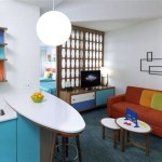
*Neutral Palette with Pops of Color:
This versatile palette relies on a foundation of neutral colors, such as whites, grays, beiges, and creams. These neutral tones create a calming and sophisticated backdrop, allowing vibrant colors to be introduced as accents through furniture, artwork, and accessories. This approach offers flexibility, as the accent colors can be easily changed to update the look of the space. *Earthy Tones:
Earthy tones, such as browns, greens, rusts, and terracotta, evoke a sense of nature and warmth. These colors create a grounding and inviting atmosphere. They are often paired with natural materials, such as wood, stone, and linen, to enhance the organic feel of the space. Earthy palettes are well-suited to spaces where relaxation and connection to nature are desired. *Coastal Inspired Palette:
Coastal palettes typically consist of blues, greens, whites, and sandy beiges. These colors evoke the feeling of the ocean and the beach, creating a breezy and refreshing atmosphere. Light and airy fabrics, such as linen and cotton, are often used in conjunction with this palette to enhance the coastal vibe. Coastal palettes are ideal for spaces where a sense of tranquility and escape is desired. *Monochromatic Gray Palette:
A monochromatic gray palette uses different shades, tints, and tones of gray to create a sophisticated and contemporary look. This palette can be surprisingly versatile, ranging from light and airy to dark and dramatic. To prevent the space from feeling too cold or sterile, it's important to incorporate texture and different materials, such as wood, metal, and fabric. A monochromatic gray palette can create a sense of calm and order. *Bold and Vibrant Palette:
For those seeking a more energetic and playful aesthetic, a bold and vibrant palette may be appropriate. This palette uses strong and saturated colors, such as reds, yellows, blues, and oranges, to create a sense of excitement and visual interest. It's important to balance these bold colors with neutral tones to prevent the space from feeling overwhelming. A bold and vibrant palette can be used to create a focal point or to highlight architectural features.The selection of an interior palette is an iterative process that requires careful consideration of color theory, practical factors, and personal preferences. By understanding these principles and exploring different color schemes, it is possible to create spaces that are not only aesthetically pleasing but also functional and conducive to the well-being of their occupants. Successfully integrating a color palette depends on thoughtful consideration for architectural details and the consistent testing of paint samples in varied lighting conditions.
```
Color Palette For Home 12 Combos Designers Love Havenly Interior Design Blog

20 Modern Home Color Palettes

Palette For Interior Design Color Ideas

Living Room Interior Color Palette Planner 5d Decor Colors Schemes

9 Design Ideas For Your Home To Achieve A Green Colour Palette Nippon Paint Singapore

8 Foolproof Color Palette Ideas For Every Room

Designing With A Bold Color Palette Ideas For Your Home Acampora Interiors

87 Interior Design Color Palette Ideas In 2024 Icolorpalette

Color Palette For Home 12 Combos Designers Love Havenly Interior Design Blog

20 Top Interior Color Schemes For Your House Design Foyr Neo