Interior Paint Colour Schemes: Examples and Considerations
Selecting the appropriate paint colour scheme for an interior space is a crucial decision impacting the overall aesthetic, mood, and perceived value of a home or building. The process involves careful consideration of various factors, including the size and layout of the room, the natural and artificial lighting, the existing furnishings, and the desired atmosphere. A well-chosen colour scheme can enhance a space, making it feel larger, brighter, warmer, or more inviting. Conversely, a poorly selected scheme can detract from the overall design and create an undesirable ambiance.
Interior designers and homeowners alike utilize colour theory principles to create harmonious and visually appealing spaces. Colour theory provides a framework for understanding how colours interact and influence each other. Understanding the colour wheel, colour harmonies (such as complementary, analogous, and triadic), and the psychological effects of various colours are essential components for effective colour scheme selection.
This article will explore several common and effective interior paint colour schemes, providing examples and discussing the considerations involved in their successful implementation.
Monochromatic Colour Schemes: Simplicity and Elegance
A monochromatic colour scheme utilizes variations of a single hue. This approach creates a sense of unity and tranquility within a space. It typically involves selecting a base colour and then incorporating lighter and darker shades, tints, and tones of that colour throughout the room. For example, a monochromatic scheme based on the colour blue might include a navy blue accent wall, a light blue ceiling, and various shades of blue in the furniture and accessories.
The key to a successful monochromatic scheme is to introduce sufficient contrast and texture to prevent the space from feeling flat or monotonous. This can be achieved through the use of varying sheens of paint (e.g., matte, eggshell, satin, semi-gloss), different textures in the fabrics and furnishings, and the incorporation of natural materials such as wood or stone. A room painted entirely in one flat colour can lack depth and visual interest; therefore, careful attention to layering and texture is paramount.
Example: Imagine a living room painted in various shades of gray. The walls could be a light dove gray, the trim a slightly darker charcoal gray, and the ceiling a very pale off-white gray. To add interest, a textured gray rug, light gray linen upholstery, and silver-toned metal accents are incorporated. The varying textures and subtle shade differences prevent the room from feeling cold or sterile.
Another Example: A bedroom using various shades of green. The walls could be a muted sage green, the bedding a combination of darker forest green and lighter mint green, and wooden furniture to add warmth. Accents of gold or brass can complement the green tones and add a touch of luxury.
The appeal of monochromatic schemes lies in their inherent simplicity and calming effect. They are often a good choice for bedrooms, bathrooms, and other spaces where a sense of relaxation and serenity is desired.
Analogous Colour Schemes: Harmonious and Balanced
Analogous colour schemes involve selecting colours that are adjacent to each other on the colour wheel. These colours share a common hue and create a harmonious and balanced effect. For example, a scheme might incorporate blue, blue-green, and green. These colours blend seamlessly and create a sense of flow and continuity.
When using an analogous scheme, it is important to choose one colour as the dominant colour and use the others as accents. This prevents the scheme from becoming too visually overwhelming. The dominant colour typically covers the largest surface areas, such as the walls, while the accent colours are used in smaller doses for furniture, accessories, and trim.
Example: Consider a dining room painted in shades of yellow, yellow-orange, and orange. The walls could be a soft yellow, the curtains a vibrant yellow-orange, and the table accessories a warm orange. This combination creates a welcoming and inviting atmosphere.
Another Example: A living room featuring blue, blue-violet, and violet. The walls are painted a soothing blue, the sofa a deep blue-violet, and throw pillows and artwork incorporate varying shades of violet. This scheme creates a sophisticated and calm environment.
Analogous colour schemes are versatile and can be used in a variety of spaces. They are particularly effective in creating a sense of warmth and comfort. The gentle colour transitions create a visually appealing and soothing environment.
Complementary Colour Schemes: Dynamic and Energetic
Complementary colour schemes utilize colours that are opposite each other on the colour wheel. These colours create high contrast and visual excitement. The classic example is blue and orange, but other complementary pairs include red and green, and yellow and violet.
Due to the high contrast, complementary schemes can be quite bold and energetic. It is important to use them strategically and avoid overwhelming the space. One approach is to use one colour as the dominant colour and the other as a secondary accent. For instance, a room might have predominantly blue walls with orange accents in the furniture and accessories.
Example: A home office featuring a combination of blue and orange. The walls are painted a calming, muted blue, while the desk chair and some desk accessories are in a bright, energizing orange. This provides a balance between tranquility and stimulation, suitable for a workspace.
Another Example: A kitchen using red and green. The cabinets could be a deep forest green, while the backsplash tiles and some small appliances are a vibrant red. This creates a dynamic and visually stimulating kitchen environment.
Complementary colour schemes are often used in spaces where energy and activity are desired, such as in playrooms, kitchens, and home gyms. However, they can also be used to create a sophisticated and dramatic effect when carefully balanced.
Triadic Colour Schemes: Balanced and Vibrant
A triadic colour scheme involves selecting three colours that are equally spaced on the colour wheel. Examples include red, yellow, and blue; or green, violet, and orange. This approach creates a balanced and vibrant effect. These schemes offer a greater degree of complexity than monochromatic or analogous schemes, but require careful planning to avoid visual chaos.
Similar to complementary schemes, triadic schemes benefit from selecting one dominant colour and using the other two as accents. This approach helps to create a focal point and prevent the space from feeling too busy. The dominant colour typically covers the walls or larger furniture pieces, while the accent colours are used in smaller doses for accessories, artwork, and smaller furniture items.
Example: A child's bedroom using red, yellow, and blue. The walls are painted a soft, neutral blue, with red accents in the bedding and yellow accents in the window treatments and artwork. This creates a playful and stimulating environment suitable for children.
Another Example: A living room featuring green, violet, and orange. The walls are painted a calming sage green, the sofa is upholstered in a deep violet, and orange throw pillows and artwork add pops of colour. This combination creates a sophisticated and visually interesting space.
Triadic colour schemes are suitable for spaces where vibrancy and energy are desired, but they require careful planning to ensure balance and harmony. They can be used to create a playful, sophisticated, or eclectic atmosphere, depending on the specific colours chosen and the way they are implemented.
Neutral Colour Schemes: Timeless and Versatile
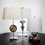
Neutral colour schemes rely on colours that are not prominently featured on the colour wheel. They are often based on shades of white, beige, gray, brown, and black. Neutral schemes offer a timeless and versatile backdrop that can be easily adapted to different styles and preferences.
While neutral schemes may seem simple, they can be incredibly sophisticated and elegant. The key is to introduce sufficient texture, pattern, and visual interest through the use of different materials, finishes, and accessories. For example, a room with white walls can be enhanced with a textured rug, linen upholstery, and wooden furniture.
Example: A minimalist apartment featuring various shades of gray. The walls are painted a light gray, the floors are a darker charcoal gray, and the furniture is a mix of gray and white. The space is accented with stainless steel and glass elements, creating a sleek and modern atmosphere.
Another Example: A rustic farmhouse featuring various shades of beige and brown. The walls are painted a warm beige, the floors are hardwood in a medium brown, and the furniture is a mix of natural wood and woven textiles. The space is accented with antique pieces and natural elements, creating a cozy and inviting atmosphere.
Neutral colour schemes are a popular choice for spaces where flexibility and longevity are desired. They provide a blank canvas that can be easily updated and accessorized to reflect changing tastes and trends. They are also a good choice for spaces where a sense of calm and serenity is desired, such as bedrooms and bathrooms.
In conclusion, the selection of an interior paint colour scheme is a multifaceted process influenced by various factors. The above examples illustrate some common approaches, but the most effective scheme will always be tailored to the specific needs and preferences of the individual and the characteristics of the space. Careful consideration of colour theory, lighting, and existing furnishings is crucial for a successful outcome.

Tips For Choosing Whole Home Paint Color Scheme House Schemes Interior

Best Interior Paint Colors Whole House Color Scheme Abby Organizes

Create A Whole House Color Palette With Real World Examples The Concierge

Interior Paint Color And Palette Ideas With S Home Bunch Design

7 Steps To Create Your Whole House Color Palette Teal Lime

Calm And Inviting Whole House Paint Scheme Colors For Home Living Room Color Schemes

Interior Paint Color And Palette Ideas With S Home Bunch Design

Whole House Color Palette How To Choose A Paint Scheme

Interior Colour Schemes Dulux

8 Trendy Neutral Colour Palette Ideas To Get Your Rooms Dripping In Style Nippon Paint Singapore