Interior Design Color Palette Combinations: A Comprehensive Guide
Color is a fundamental element of interior design, capable of influencing mood, perception, and the overall aesthetic appeal of a space. Selecting appropriate color palettes is crucial for creating harmonious and visually pleasing environments. This article explores various color palette combinations, providing guidance on their application and impact within interior design.
Understanding Color Theory Basics
Before delving into specific color combinations, a foundational understanding of color theory is essential. The color wheel, a visual representation of color relationships, is a primary tool for designers. It typically consists of twelve colors: three primary colors (red, yellow, blue), three secondary colors (green, orange, violet) created by mixing primary colors, and six tertiary colors formed by mixing a primary and a secondary color.
Key color concepts include:
*Hue:
The pure color, such as red, blue, or green. *Saturation:
The intensity or purity of a color, ranging from vibrant to muted. *Value:
The lightness or darkness of a color, ranging from white to black. *Tint:
A color mixed with white. *Shade:
A color mixed with black. *Tone:
A color mixed with gray.Understanding these concepts allows for manipulation of color to achieve desired effects within a space. For example, using tints can create a light and airy feel, while shades can add depth and drama.
Monochromatic Color Palettes
A monochromatic color palette utilizes variations of a single hue. This involves using different tints, shades, and tones of the same color to create a cohesive and unified look. Monochromatic schemes are inherently simple and elegant, often providing a sense of calmness and sophistication.
To prevent monotony in a monochromatic design, it is crucial to incorporate texture and varying materials. For example, a room dominated by blue tones could feature a velvet sofa in a deep navy shade, linen curtains in a lighter sky blue tint, and a textured rug in a gray-blue tone. This layering of textures adds visual interest and prevents the space from feeling flat.
Consider the specific hue chosen for a monochromatic palette. Warm hues like reds and oranges can create a cozy and inviting atmosphere, while cool hues like blues and greens can evoke feelings of tranquility and serenity. The choice should align with the desired mood and function of the space.
Analogous Color Palettes
Analogous color palettes involve using colors that are adjacent to each other on the color wheel. These palettes create a harmonious and balanced aesthetic, as the colors share similar undertones. Common examples include combinations like blue, blue-green, and green, or yellow, yellow-orange, and orange.
When using an analogous palette, it is recommended to select one dominant color and use the other colors as accents. This prevents the space from feeling overwhelming and ensures a sense of visual hierarchy. For example, a room could feature green walls, blue-green upholstery, and blue accents in the artwork and accessories.
Analogous palettes are particularly effective in creating a sense of flow and continuity within a space. They can be used to connect different areas of a home, creating a cohesive and unified design. Consider using varying saturation levels of the chosen colors to add depth and dimension to the space.
Complementary Color Palettes
Complementary color palettes utilize colors that are directly opposite each other on the color wheel. These combinations, such as red and green, blue and orange, or yellow and violet, create a high level of contrast and visual excitement. Complementary colors can be used to draw attention to specific features or to create a bold and dynamic atmosphere.
Due to their inherent contrast, complementary color schemes require careful consideration and balance. Using both colors in equal proportions can often be overwhelming. A common approach is to use one color as the dominant hue and the other as an accent. For example, a room could feature blue walls with orange accent pillows and artwork.
Toning down the saturation of complementary colors can also create a more subtle and sophisticated look. For example, instead of using a vibrant red and green, consider using a muted terracotta and a sage green. This softer approach can still provide a sense of contrast while maintaining a more calming atmosphere.
Triadic Color Palettes
Triadic color palettes involve selecting three colors that are evenly spaced on the color wheel. These palettes offer a balanced level of contrast and visual interest, creating a harmonious and dynamic design. Common examples include combinations like red, yellow, and blue, or green, orange, and violet.
Similar to complementary schemes, triadic palettes require careful balancing to prevent visual overload. It is generally recommended to choose one dominant color and use the other two as accents. Consider the intensity and value of each color, ensuring they complement each other and create a cohesive aesthetic.
Triadic color schemes can be particularly effective in creating a playful and energetic atmosphere. They are often used in children's rooms, playrooms, or creative work spaces. However, they can also be adapted for more sophisticated spaces by using more muted and understated tones.
Tetradic Color Palettes
Tetradic color palettes, also known as double complementary palettes, utilize two pairs of complementary colors. This means selecting four colors that form two sets of opposites on the color wheel. Due to the complexity of these palettes, they require skillful execution to avoid visual chaos.
A common approach to using a tetradic palette is to select one dominant color and use the other three as accents in varying proportions. Another option is to divide the space into distinct zones, each dominated by one of the chosen colors. This can be particularly effective in open-plan living areas.
Tetradic palettes can be used to create a rich and layered aesthetic, adding depth and complexity to a space. However, it is crucial to consider the intensity and value of each color carefully. Using a combination of light and dark tones, as well as varying saturation levels, can help to create a balanced and harmonious design.
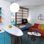
Neutral Color Palettes with Pops of Color
Neutral color palettes, based on colors like white, beige, gray, and black, provide a versatile and timeless foundation for interior design. These palettes create a sense of calm and sophistication, allowing for flexibility in decorating and adaptability to changing trends. Adding strategic pops of color can inject personality and visual interest into a neutral space.
When using a neutral palette, it is important to consider the undertones of the chosen colors. Warm neutrals, such as beige and taupe, create a cozy and inviting atmosphere, while cool neutrals, such as gray and white, evoke a sense of modernity and sophistication. The undertones should complement each other to create a cohesive and balanced design.
Pops of color can be introduced through accessories, artwork, textiles, or even a single piece of furniture. Choosing a color that contrasts with the neutral background can create a striking visual impact. Alternatively, using a color that complements the neutral tones can create a more subtle and harmonious effect.
Considerations for Specific Spaces
The selection of color palettes should also consider the specific function and characteristics of each space. For example, bedrooms often benefit from calming and restful colors like blues, greens, and lavender. These colors can promote relaxation and improve sleep quality.
Living rooms, on the other hand, can accommodate a wider range of color palettes, depending on the desired atmosphere. Warm and inviting colors like reds, oranges, and yellows can create a cozy and convivial space, while cool and sophisticated colors like blues, greens, and grays can evoke a sense of elegance and modernity.
Kitchens and bathrooms often benefit from bright and clean colors that promote a sense of hygiene and freshness. Whites, creams, and light blues are common choices for these spaces. However, bold accent colors can be used to add personality and visual interest.
The Influence of Lighting
Lighting plays a crucial role in how colors are perceived within a space. Natural light tends to enhance the true colors of a room, while artificial light can alter them significantly. Incandescent lighting, for example, tends to warm up colors, while fluorescent lighting can make them appear cooler.
It is important to consider the type of lighting used in a space when selecting color palettes. If a room primarily relies on artificial lighting, it may be necessary to adjust the colors to compensate for the lighting's effects. For example, using warmer tones in a room with cool lighting can help to create a more balanced and inviting atmosphere.
Layered lighting schemes, which combine ambient, task, and accent lighting, can also enhance the visual appeal of a color palette. Proper lighting can highlight specific features, create depth and dimension, and enhance the overall mood of a space.
Testing Colors Before Committing
Before committing to a particular color palette, it is essential to test the colors in the actual space. Paint samples can be applied to the walls and observed under different lighting conditions throughout the day. This allows for a more accurate assessment of how the colors will look in the finished space.
Fabric swatches and other material samples can also be used to visualize the overall design scheme. Comparing these samples side-by-side can help to ensure that the colors and textures complement each other and create a cohesive aesthetic.
Taking the time to test colors and materials before making a final decision can prevent costly mistakes and ensure a successful interior design project.

Color Palette For Home 12 Combos Designers Love Havenly Interior Design Blog

Color Palette For Home 12 Combos Designers Love Havenly Interior Design Blog

Color Palette For Home 12 Combos Designers Love Havenly Interior Design Blog
:max_bytes(150000):strip_icc()/7XghHk_full2-b3835383b6924afe8d082db04ba7aad5.jpg?strip=all "Color Palette Generators For Interior Design Schemes")
Color Palette Generators For Interior Design Schemes

20 Best Modern Home Color Palettes Room Combinations Offeo Interior House Colors Palette Living Combination

9 Design Ideas For Your Home To Achieve A Green Colour Palette Nippon Paint Singapore

87 Interior Design Color Palette Ideas In 2024 Icolorpalette

87 Interior Design Color Palette Ideas In 2024 Icolorpalette

Home Decoration Cosy Relaxing Colour Palettes To Take Inspo From Girlstyle Color Palette Interior Design Living Room Combination

20 Top Interior Color Schemes For Your House Design Foyr Neo