Color Theory in Interior Design: A Guide to Harmony and Emotion
Color theory is a fundamental principle in design that explores the psychological and aesthetic effects of colors. It delves into the relationships between colors, their impact on human perception, and how they can be effectively used to create specific moods and atmospheres. In interior design, color theory plays a crucial role in shaping spaces that are not only visually appealing but also conducive to the desired purpose and emotions. Understanding the basic principles of color theory can empower designers and homeowners to make informed choices that enhance the overall ambiance and functionality of a room.
Understanding the Color Wheel
The color wheel is a visual representation of the relationships between colors. It comprises primary, secondary, and tertiary colors, each with its own distinct characteristics. Primary colors (red, yellow, and blue) cannot be created by mixing other colors, while secondary colors (orange, green, and violet) are created by mixing two primary colors. Tertiary colors are formed by mixing a primary color with an adjacent secondary color. The color wheel provides a framework for understanding color harmonies, which are combinations of colors that create visually pleasing and balanced effects.
Color Harmonies: Building Visual Interest
Color harmonies are established based on the proximity and relationships of colors on the color wheel. Some common color harmonies include:
- Complementary: Colors opposite each other on the wheel, creating high contrast and visual excitement (e.g., red and green, blue and orange).
- Analogous: Colors adjacent to each other on the wheel, creating a harmonious and cohesive feel (e.g., blue, blue-green, and green).
- Triadic: Three colors evenly spaced on the wheel, offering vibrant and balanced schemes (e.g., red, yellow, and blue).
- Split-Complementary: One color and the two colors adjacent to its complement, creating a vibrant but less intense contrast than complementary schemes (e.g., blue, yellow-orange, and red-orange).
- Monochromatic: Different shades, tints, and tones of a single color, creating a serene and sophisticated atmosphere (e.g., various shades of blue).
These harmonies are not rigid rules but rather guiding principles that can be adapted and modified to suit individual preferences and design goals.
Psychological Impact of Colors
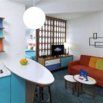
Colors are not only visual elements but also evoke strong psychological and emotional responses. This is why choosing the right color palette is crucial in interior design. For instance, warm colors like red, orange, and yellow are associated with energy, excitement, and warmth. They can be used to create stimulating environments or add vibrancy to a space. Cool colors like blue, green, and purple, on the other hand, are often linked to calmness, tranquility, and serenity. They are ideal for promoting relaxation and creating a sense of peace in a bedroom or bathroom.
The psychological impact of colors can be further influenced by factors such as:
- Light: The amount and type of light in a space can significantly affect how colors are perceived.
- Surrounding elements: The colors of furniture, fabrics, and accessories can influence the overall mood and ambiance of a room.
- Personal preferences: Individual tastes and cultural backgrounds can play a role in color preference.
Applying Color Theory in Interior Design
Color theory is a powerful tool for creating visually appealing and functionally effective interior spaces. Whether designing a residential home, a commercial space, or a public area, color theory can be applied in various ways to achieve desired outcomes. These include:
- Creating a mood: Using warm colors to encourage socialization in a living room, cool colors to promote relaxation in a bedroom, or vibrant colors to stimulate creativity in a workspace.
- Defining spaces: Using color to visually separate different areas within a room, such as a dining area from a living area.
- Drawing attention: Employing accent colors to highlight certain features, such as artwork or a fireplace.
- Balancing proportions: Using lighter colors to make small spaces feel larger and darker colors to ground larger spaces.
By understanding the principles of color theory and applying them to interior design, designers and homeowners can create spaces that are not only visually pleasing but also emotionally resonant and conducive to the desired purpose.

Color Theory Basics How To Use For Interior Design Foyr

Color Theory For Decorating So Much Better With Age

How To Use Color Theory In Home Interior Design Homeadvisor

Color Theory For Decorating So Much Better With Age

Color Theory Interior Design Overview Examples Lesson Study Com

Color Theory Basics How To Use For Interior Design Foyr

How To Pick Colors For Your Home E Interiors Color Theory Art Wheel Interior Design

Color Theory Basics How To Use For Interior Design Foyr

How Where To Use Color In Your Home Palette Easy S

How To Apply Colour Theory Psychology Interior Design