Beyond Blue Interiors: Exploring Depth and Nuance in Design
Blue, a color often associated with tranquility, stability, and depth, holds a prominent place in interior design. Its versatility allows it to be incorporated into a wide range of styles, from coastal and Scandinavian to modern and traditional. However, the effective use of blue in interiors extends far beyond simply painting walls. It requires a nuanced understanding of its various shades, pairings, and the psychological impact it can have on inhabitants. "Beyond Blue Interiors" delves into these complexities, exploring the multifaceted nature of blue in creating captivating and harmonious living spaces. This exploration emphasizes strategic application, thoughtful color coordination, and a consideration for the emotional atmosphere blue creates.
Understanding the Psychology of Blue
The psychological effects of color are well-documented and play a crucial role in interior design choices. Blue, in particular, evokes feelings of calmness, serenity, and intellectual stimulation. Lighter shades, such as sky blue and pale turquoise, project an airy and peaceful ambiance, making them suitable for bedrooms, bathrooms, and spaces intended for relaxation. These hues can also create an illusion of spaciousness, particularly beneficial in smaller rooms. Conversely, darker shades of blue, such as navy and indigo, exude sophistication, authority, and stability. They are often employed in formal settings like living rooms, libraries, or studies to create a sense of gravitas and depth. The impact of blue on mood highlights the importance of selecting the right shade based on the intended purpose of the room and the desired emotional response.
The context in which blue is used also significantly impacts its perceived effect. A bright, saturated blue might be energizing in a minimalist, modern setting, but overwhelming in a richly decorated traditional room. Similarly, a muted, gray-toned blue can be comforting in a bedroom but might feel somber in a brightly lit kitchen. Therefore, understanding the psychological weight of different blue hues and their interaction with the overall design scheme is crucial for achieving a balanced and harmonious interior.
Mastering Blue Color Palettes
The effectiveness of blue in interior design is heavily reliant on its pairing with other colors. A monochromatic palette, featuring different shades and tints of blue, can create a sophisticated and calming effect, particularly when layered with varying textures. For example, a room featuring navy blue walls could be complemented by lighter blue upholstery and accessories, creating a cohesive and visually interesting space without introducing contrasting colors.
Complementary color schemes, utilizing colors opposite blue on the color wheel, such as orange and yellow, offer a bolder and more dynamic approach. A touch of orange in a room dominated by blue can create a vibrant contrast, adding warmth and energy. This is especially effective in spaces where a feeling of playfulness or creativity is desired. Analogous color schemes, incorporating colors adjacent to blue on the color wheel, such as green and violet, create a harmonious and nature-inspired ambiance. These palettes often evoke feelings of tranquility and balance, making them suitable for bedrooms and living areas.
Neutral colors, such as white, gray, and beige, provide a versatile backdrop for blue, allowing it to take center stage. White and light gray enhance the crispness and clarity of blue, making it appear more vibrant and fresh. Beige and other warm neutrals soften the intensity of blue, creating a more inviting and cozy atmosphere. The choice of accompanying colors directly influences the overall aesthetic and emotional impact of blue in interior design.
Materiality and Texture in Blue Interiors
The texture and materiality of surfaces play a crucial role in enhancing the visual and tactile experience of blue in interior spaces. Smooth, glossy surfaces, such as polished tiles or lacquered furniture, reflect light and amplify the vibrancy of blue, creating a sense of opulence and sophistication. Matte surfaces, such as linen fabrics or textured walls, absorb light and create a more subdued and calming effect. The interplay of these textures adds depth and complexity to the design, preventing it from feeling flat or monotonous.
Natural materials, such as wood, stone, and metal, complement blue beautifully, adding warmth and organic texture to the space. The warm tones of wood contrast with the coolness of blue, creating a balanced and inviting atmosphere. Stone surfaces, particularly those with natural variations in color and texture, add a sense of grounding and stability to the design. Metallic accents, such as brass or copper, can add a touch of glamour and sophistication to blue interiors, particularly when used sparingly to highlight key features.
Textiles, such as velvet, linen, and wool, offer another opportunity to introduce texture and depth to blue interiors. Velvet adds a luxurious and tactile element, while linen provides a more relaxed and casual feel. Wool adds warmth and comfort, making it suitable for colder climates. The selection of appropriate materials and textures is essential for creating a well-rounded and visually appealing blue interior.
Lighting and the Perception of Blue
Lighting significantly influences how blue is perceived in interior spaces. Natural light enhances the clarity and freshness of blue, making it appear more vibrant and inviting. Artificial lighting, on the other hand, can alter the appearance of blue, depending on its color temperature. Warm-toned lighting can soften the coolness of blue, creating a more inviting and cozy atmosphere. Cool-toned lighting can enhance the crispness and clarity of blue, making it appear more modern and sophisticated. The careful consideration of lighting is crucial for achieving the desired effect with blue in interior design.
Layered lighting, incorporating ambient, task, and accent lighting, can further enhance the visual interest of blue interiors. Ambient lighting provides overall illumination to the space, while task lighting focuses on specific areas for reading or working. Accent lighting highlights architectural features or artwork, adding depth and dimension to the design. The strategic placement of lighting fixtures can transform the perception of blue, creating a more dynamic and visually engaging space.
Dimming systems offer another level of control over the lighting environment, allowing inhabitants to adjust the intensity of light based on their mood and activities. This can be particularly beneficial in spaces where a variety of uses are accommodated, such as living rooms or bedrooms. The ability to fine-tune the lighting enhances the versatility of blue in interior design, making it adaptable to a wide range of situations.
Blue in Different Design Styles
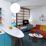
The versatility of blue allows it to be seamlessly integrated into a wide array of interior design styles. In coastal interiors, various shades of blue, particularly light blues and turquoises, are used to evoke the feeling of the ocean and sky. These hues are often paired with natural materials like wood, linen, and jute, creating a relaxed and breezy atmosphere. In Scandinavian design, muted shades of blue are combined with white and gray to create a serene and minimalist space. The emphasis is on simplicity and functionality, with blue acting as a subtle accent to add depth and interest.
In modern interiors, bold and saturated shades of blue are often used to create a statement. These colors are typically paired with clean lines, geometric shapes, and metallic accents, resulting in a sleek and sophisticated look. In traditional interiors, darker shades of blue, such as navy and indigo, are used to create a sense of formality and grandeur. These colors are often paired with rich fabrics, ornate furniture, and antique accessories, resulting in a classic and timeless aesthetic.
The key to successfully incorporating blue into different design styles lies in understanding the specific characteristics of each style and selecting the appropriate shade and application of blue to complement those characteristics. This requires a careful consideration of the overall color palette, materials, and furnishings, ensuring that the blue elements integrate seamlessly into the existing design scheme.

Beyondblue Interiors 15 Photos 4350 Lassiter Ste 102 Raleigh North Ina Home Decor Phone Number Yelp

Lincoln Corsair Is The Sedan Lover S Suv And Much More Continental Owner Club Western Region

Ia Ortiz Beyond Blue Interiors Linkedin

2024 Lincoln Corsair Beyond Blue Interior Photo Gallery

Ia Ortiz Beyond Blue Interiors Linkedin

2024 Lincoln Corsair Beyond Blue Interior Photo Gallery

2024 Lincoln Aviator Vs Corsair Don Franklin

Monochrome Paint Collection Offers Maximum Impact Minimum Effort Colour Combinations Ribaj

When It Comes To Color Lincoln Drivers Love Having The Blues News Wheel

Are Your Walls 2024 Enough Find Out With Our Edit Of The Latest Paint Collections