The Enduring Appeal of Light Blue Interior Paint
Light blue interior paint occupies a significant and consistent space within the world of interior design. Its versatile nature allows it to complement a wide range of styles, from the coastal serenity of beach houses to the sophisticated calm of modern apartments. The popularity of light blue stems from its inherent ability to evoke feelings of tranquility, openness, and cleanliness, often associated with natural elements like the sky and the ocean. Understanding the nuances of light blue paint, its application, and its impact on a space is crucial for homeowners, designers, and anyone engaging in interior decorating projects.
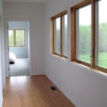
The selection of a specific shade of light blue is a critical decision. The spectrum of light blues available is extensive, ranging from barely-there pastels to more saturated, almost turquoise-like hues. Each variation possesses unique characteristics that contribute to the overall atmosphere of the room. Considerations should include the room's natural lighting, the existing furnishings, and the desired emotional impact. A north-facing room with limited natural light might benefit from a warmer-toned light blue to counteract the coolness, while a south-facing room can handle cooler shades without feeling stark.
Beyond the aesthetic considerations, the practical aspects of using light blue paint should not be overlooked. Factors like the paint's finish (matte, eggshell, satin, semi-gloss, or gloss) influence its durability, cleanability, and light reflectivity. Matte finishes are excellent for hiding imperfections but are less durable and harder to clean than glossier options. Eggshell and satin finishes strike a balance between aesthetics and practicality, making them ideal for living rooms and bedrooms. Semi-gloss and gloss finishes are best suited for areas prone to moisture and heavy use, such as bathrooms and kitchens.
Psychological Effects and Associations
The color blue, in general, is often associated with calmness, trust, and stability. Light blue, in particular, reinforces these sentiments while adding a layer of airiness and optimism. Its association with the sky and ocean fosters a sense of freedom and expansiveness. This psychological effect makes light blue an ideal choice for spaces intended for relaxation and rejuvenation, such as bedrooms, bathrooms, and meditation rooms. It can also be effectively used in home offices to promote focus and reduce stress.
Light blue's calming qualities can extend to its impact on perceived room size. Light colors, including light blue, reflect more light than darker colors, which can make a room feel larger and more open. This is especially beneficial in smaller spaces or rooms with limited natural light. By strategically using light blue paint, designers can create a more spacious and inviting atmosphere, even in confined areas.
Furthermore, light blue has been found to potentially lower blood pressure and heart rate, contributing to a sense of overall well-being. While the effects of color psychology are subjective and can vary among individuals, the consistent association of blue with relaxation makes it a valuable tool in creating a harmonious and stress-free home environment.
Complementary Colors and Design Styles
The versatility of light blue extends to its compatibility with a wide range of colors and design styles. Its neutrality allows it to serve as a backdrop for bolder accent colors or to blend seamlessly with softer, more muted palettes. Understanding which colors complement light blue is crucial for achieving a cohesive and aesthetically pleasing design.
White is a classic pairing with light blue, creating a clean and airy aesthetic that is often associated with coastal or Scandinavian design. The combination evokes images of beaches, clouds, and open skies, fostering a sense of serenity and tranquility. Cream and beige offer a warmer alternative to white, adding a touch of sophistication and elegance to the space. These neutral pairings allow the light blue to remain the focal point while providing a sense of balance and harmony.
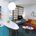
For those seeking a more vibrant and dynamic look, light blue can be effectively paired with complementary colors like coral, peach, and yellow. These warm hues create a visually stimulating contrast that adds energy and personality to the room. Using these colors as accents in the form of throw pillows, artwork, or decorative accessories can inject a sense of playfulness and vibrancy without overwhelming the calming effect of the light blue walls.
Light blue also works well with natural materials like wood, stone, and linen. The combination of light blue with wood tones creates a warm and inviting atmosphere that is both rustic and refined. Using natural stone accents, such as a fireplace surround or a bathroom backsplash, adds a touch of organic texture and visual interest. Linen textiles, in the form of curtains, upholstery, or bedding, further enhance the natural and relaxed feel of the space.
Specific Room Applications and Considerations
The application of light blue paint varies depending on the room and its intended function. Different considerations apply to bedrooms, bathrooms, living rooms, and kitchens when selecting the appropriate shade, finish, and design elements.
In bedrooms, light blue is a particularly effective choice for creating a restful and calming atmosphere. Softer, more muted shades of light blue are often preferred in bedrooms to promote relaxation and sleep. Pairing light blue walls with soft bedding, plush rugs, and dim lighting can create a serene and inviting sanctuary. Incorporating natural elements, such as potted plants or wooden furniture, further enhances the calming effect of the space.
Bathrooms benefit significantly from the clean and refreshing qualities of light blue paint. Its association with water makes it a natural choice for creating a spa-like atmosphere. Lighter shades of light blue can make a small bathroom feel larger and more open. Combining light blue walls with white fixtures and chrome accents creates a classic and timeless look. Incorporating natural stone or tile accents adds a touch of luxury and sophistication.
Living rooms can effectively utilize light blue as a neutral backdrop for a variety of design styles. Its versatility allows it to complement both modern and traditional furnishings. Using light blue walls as a canvas for bolder accent colors, such as coral or yellow, can create a vibrant and inviting space. Pairing light blue with neutral furniture and natural textures creates a more relaxed and sophisticated atmosphere. The chosen shade of light blue should reflect the desired mood and style of the living room.
Kitchens, while less commonly painted entirely light blue, can benefit from its use as an accent color or on cabinetry. Light blue cabinets can add a touch of personality and character to a kitchen, especially when paired with white countertops and stainless steel appliances. Using light blue as an accent color on backsplashes or wall decor can create a refreshing and inviting atmosphere. The durability and cleanability of the chosen paint finish are particularly important in kitchens due to the increased risk of spills and splatters.
Ultimately, the successful integration of light blue interior paint requires careful consideration of the room's function, existing furnishings, desired mood, and the interplay of light and color. With thoughtful planning and execution, light blue can transform any space into a haven of tranquility and style.

Light Blue Wall Colors Don T Make This Mistake Laurel Home

10 Lovely Light Blue Paint Colors For A Bedroom

Painting Our Living Room Light Blue Emily A Clark

7 Best Baby Blue Paint Colors Ideas Room Interior

Behr Pro 1 Gal T14 5 Sky Blue Dead Flat Interior Paint Pr10501 The Home Depot

Feeling Blue Interior Painting With Sky Turquoise And More Jerry Enos

Behr Premium Plus 1 Qt T14 5 Sky Blue Satin Enamel Low Odor Interior Paint Primer 705004 The Home Depot

Glidden One Coat Interior Paint And Primer Scandinavian Sky Blue 1 Quart Flat Com

Better Homes Gardens Interior Paint And Primer Cottage Blue 1 Gallon Satin Com

5 Interior Paint Color Trends For Spring Hilton Head